Franck Muller WPHH2015 : contercurrent 2/2.
Hi people,
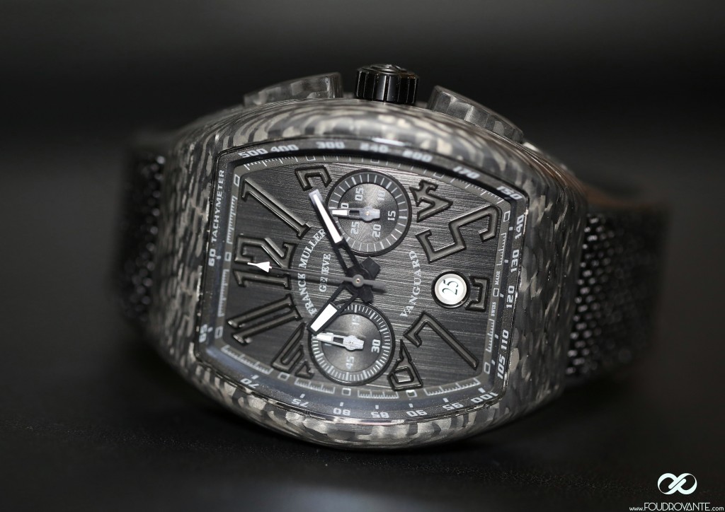
The Vanguard Carbon Chronograph.
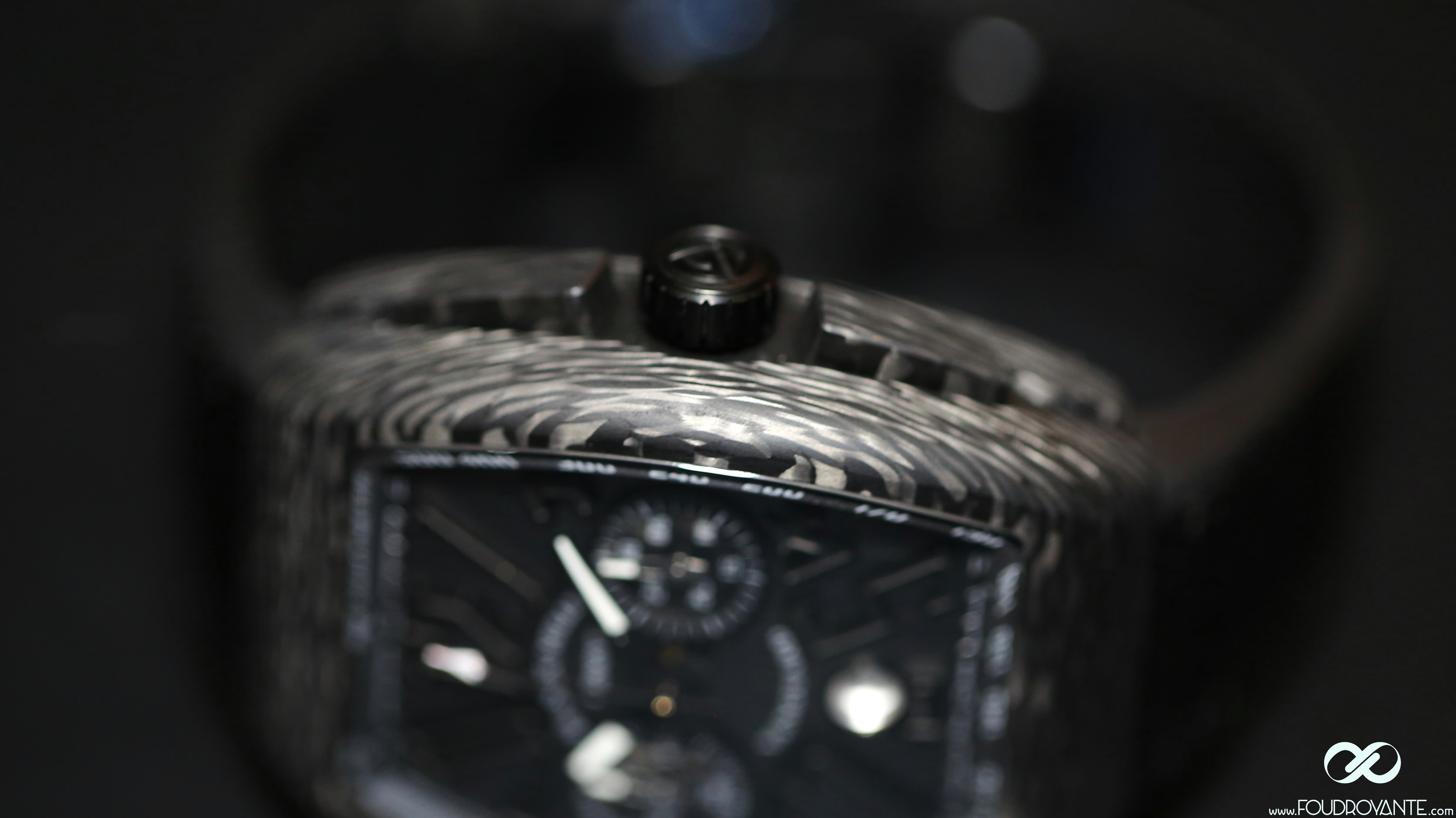
This watch is emblematic of the product and image renewal of Franck Muller’s manaufacture. First, the DNA remains the same: large lettering style, chic barrel case and Eta Valjoux 7750 caliber. Then, everything eles is changed, we move from a chic and off the wall product, a bit dandy, to a sport/chic, almost military watch.
Military of course, the black carbon makes reference to stealth, but also to motor sports, without getting into red touches or other traditional grigris, the military aspect taking priority over the motor sports aspect.
- Still there’s this anthracite case. Obtaining a fur tending to black is one of big challenges for sport/chic watchmaking. There is no perfect solution. Surely not steel, this magical metal, cheap, easy-to-work, stable, ease to polish as nearly as beautiful as platinium.
To me, the range of solutions goes to the worst to the least bad. Let’s start with the worst:
galvano with aluminium or titanium case, that we can notably see on the Penarai composites. As the time goes on, galvano skips and the case gets very ugly-looking.
Then comes ceramic: many brands use and abuse it, especially Rado and Hublo. It’s lovely, it’s maintenance free, and provides an either seventies or cyberpunk look. But ceramic is easy to break, that’s paradoxically why it is used in composite tank armour: ceramic never breaks in the direction of impact, projectiles are misdirected. And its costs a lot when it breaks.
There is also the traditional PVD or DLC, but it is only a plating, it is not really noble. Still there is an advantage: the wear is on the edges, it gives a “gunshot” touch which is always nice, except if the watch doesn’t fit with it.
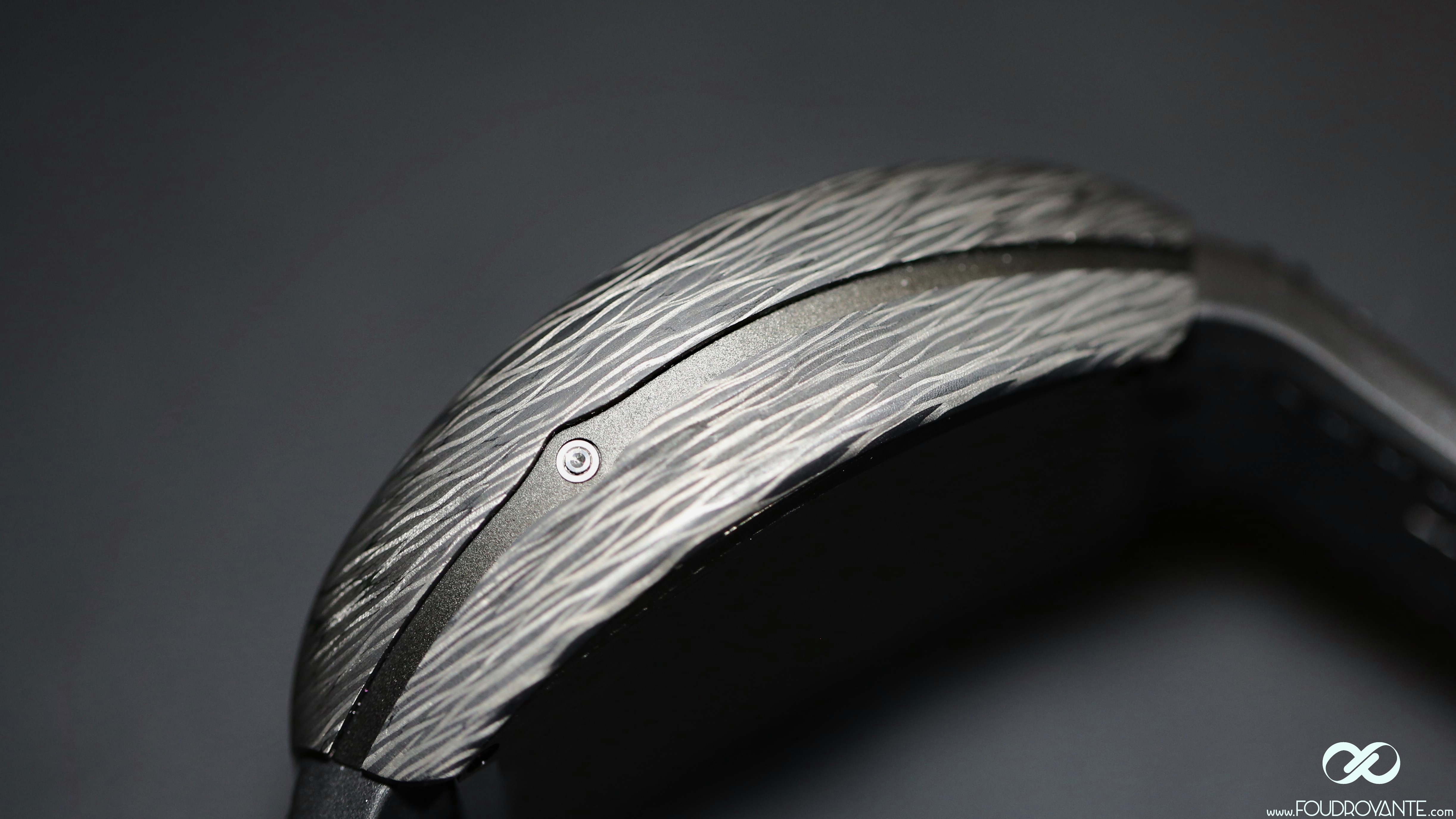
Carbon remains the least bad solution. It is the only one which blends an original material with resistance (unbreakable) , the nobility of a black material in the mass and longevity.
To produce the fibre, it takes an ultrafine polyacrylonitrile (a polymer) thread (less than five microns) attacked with acid in order to allow the carbon atoms to fix. This thread is covered with a layer of carbon and subsequently woven.
Eventually, several layers of this fabric are laid on top of each other, and are agglomerated with specific resins. The finished product is a bloc of carbon fibre.
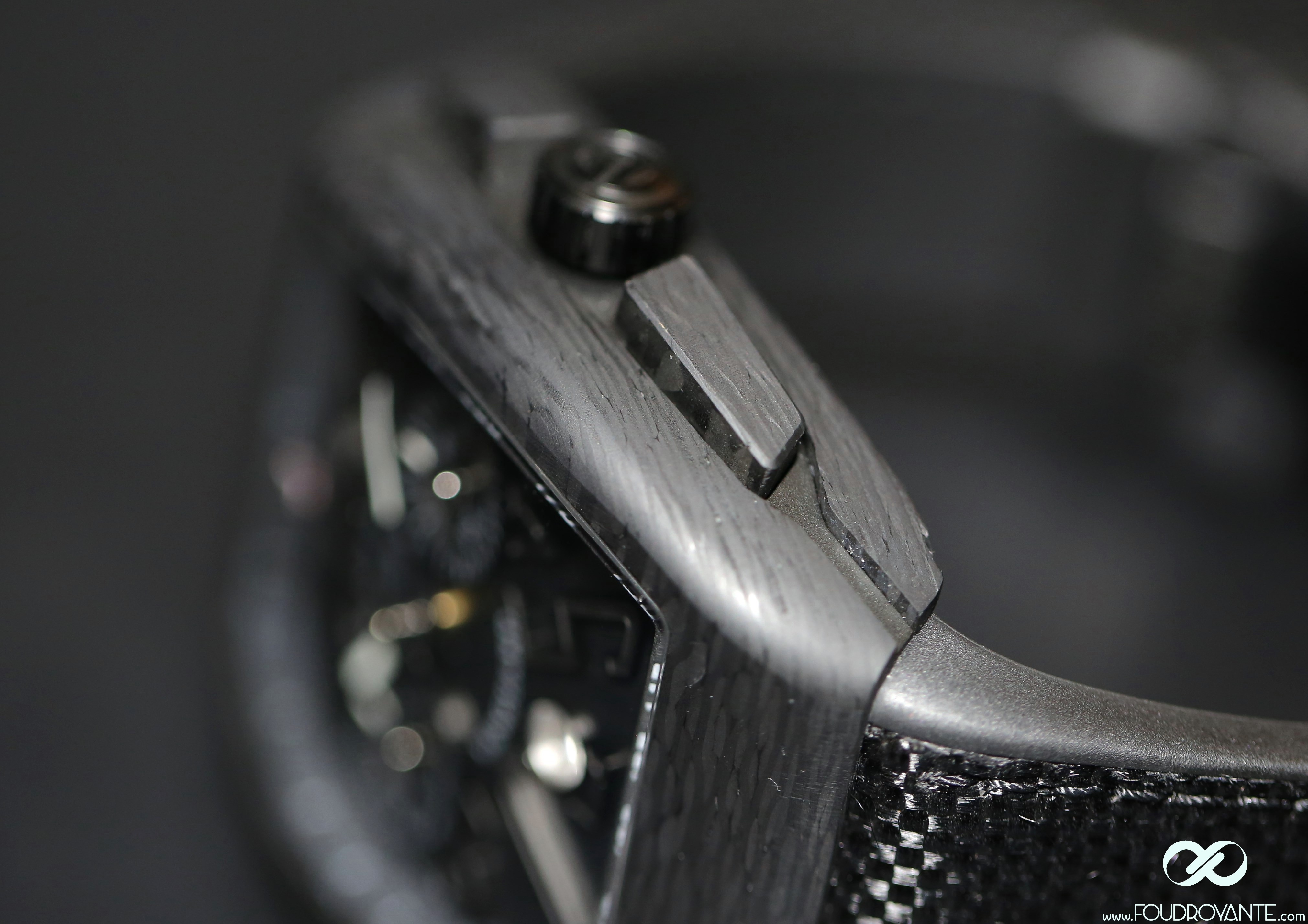
Those blocs are then processed on the CNC, a time-consuming task, to obtain the components of your Franck Muller’s case. These are then assembled according to classic techniques.
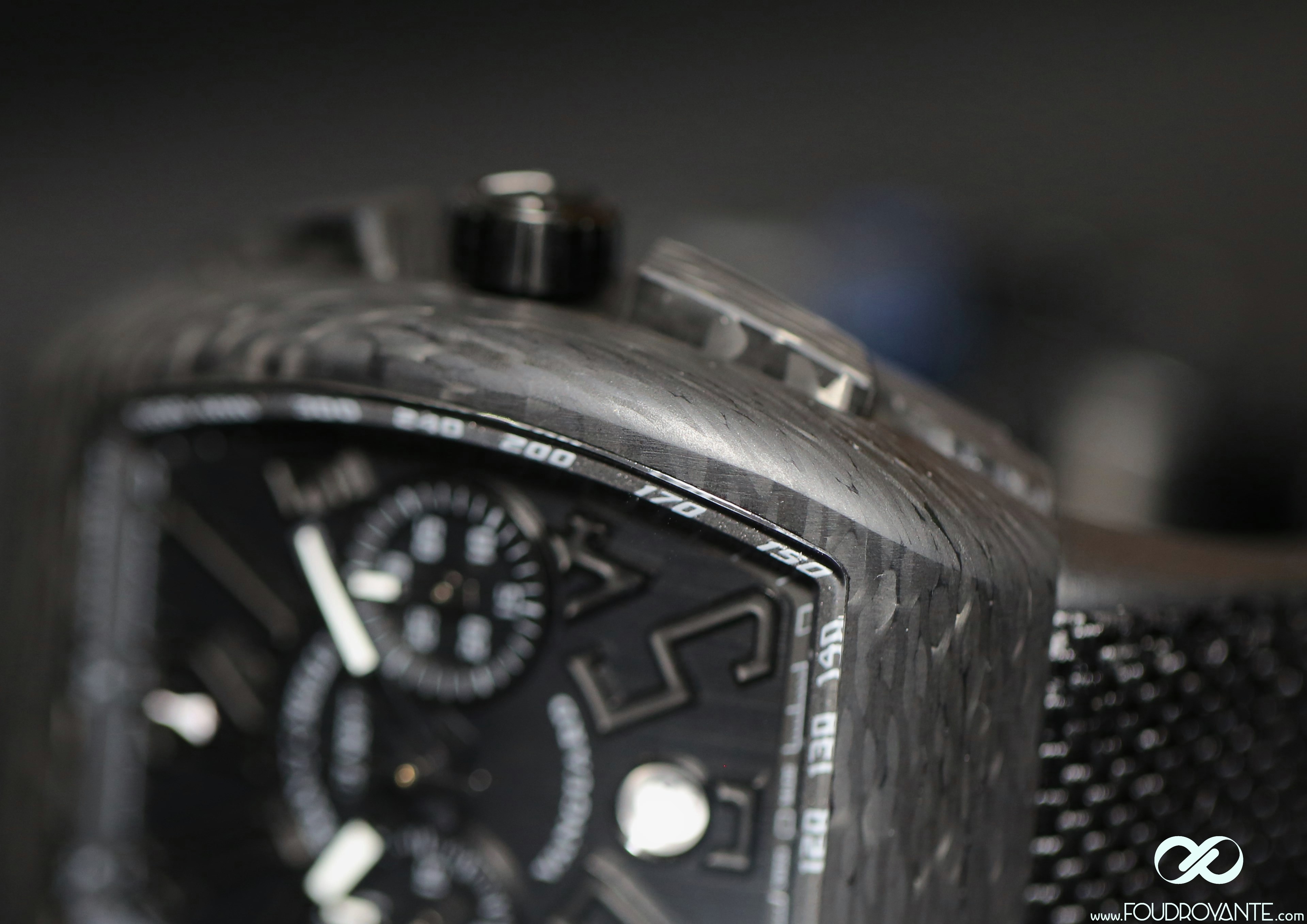
As you ca see on the pictures, the blocs haven’t been processed from the top of the fibre, as they usually are, but from the edge. It is the first time I’ve seen this type of machining in watchmaking. It strenghtens a lot the military effect,
because the carbon pattern instantly evokes the “digi-camo” of contemporary combat suits.
This digi-camo case is ultra light, its density is only twice that of water, against four times for titanium and almost nine for steel. The combination of the fiber heat, the curve of Franck Muller’s barrel and the lightness of the carbon case makes the watch incredibly comfortable. We forget about it right away, it’s nearly too light when you like heavy watches made of precious metals (“it’s a watch, but it’s also a weapon…”)
The last time I had the occasion to wear such a comfortable watch, it was the RM027 “Nadal” (20gr) sold in 2011 at Only Watch; The differences between those two are about 30gr and 500,000EUROS… The Vangard is sold 13,500€, and the Nadal 510.000€…
If you look for a sports watch, it’s a real must-have, as it is very light and comfortable. With regards to impermeability, The chronograph may help you measuring your performances. It’s equipped with the well-known Valjoux 7750 caliber, a mechanism whose lack of watch-making nobility is widely compensated by a great reliability and precision.
I have owned two 7750, a Breit Navitimer and a Sub Panerai, on of the most accurate watch i’ve ever owned, with an average +1,5 sec per day.
- Not many very expensive watches (the price of a house) can boast the same level of chonometric performances. ETA must take credit, only the total industrialisation level (spirals in particular)of Swatch group allows this type of accurancy.
Finally, last element, the dial. It’s different from the 3 hands version, which is equipped with a carbon dial reinforcing the digi-camo aspect. That of this chronograph declination is brushed lenghtwise, which makes it a bit more stylish, and contributes to create visual height on the watch. The Franck Muller’s large indexes has Luminova flanks machined from solid, the wath discreetly gives you the time in the dark.
In my opinion, the defect of this watch is the date window, not in line with the piece, but above all with a white disc in it, which seems relatively incomprehensible to me in this very “dark side” context. Hey, is Dark Vador getting blind?
When in doupt, let’s hope that the final version will be equipped whit a dark date window as it is on the three hands version. For the record, the watches presented here are prototypes, so they may not comply with the final model.
- In chronograph or three hands version, with its contemporary style, its carbon case and its attractive price (lower than that of a carbon Panerai for instance), is a must have for whoever looks for an all dark watch.
From darkness to light, fractionated:
Infinity Time is a Woman
The 2008 crisis (and the current that progressively affects watchmaking) led to a market saturation. To compensate, the prestige manufactures have been targeting a new type of customer: the women’s market (the watchmaking industry is following the irresistible progress of capitalism, with an 80 year lag: in ten years, we’ll move from whatchmaking advertising to communication ;).
And almost every prestige house has rushed into the breach, proposing very feminine and often very beautiful watches.
By the way, the SIHH2014 & 2015 have been very prolific about it. Van Cleef & Arpels reinvented the prescription: roud case a bit off-beat, diamonds on the bezel, decorative motifs mother-of-pearl engraved, little flowers, kind animals. Everybody has put his spin on it. Watchmaking originality…
From the watchmaking’s perspective, woman is kind of a princess who hasn’t completely left childhood yet, she’s beautiful but a little silly…
Let us be clear, those watches are gorgeous, very well-finished, very expensive too. But it gets a little boring, it feels like permanently drifting in naive Rousseau’s impressionism out of Grimm’s tales.
In spite of the beauty of those dreamlike universes, the real problem is that we are far from contemporary woman’s everyday life,
torn between her traditional woman’s duties (children, marriage, ect…), her stressful job (cut throat meetings, court battles, surrealistic videoconferences, ect…), and the growing order to stay good-looking, (bloody waxings, sexy but unconfortable clothes, untenable diet…)
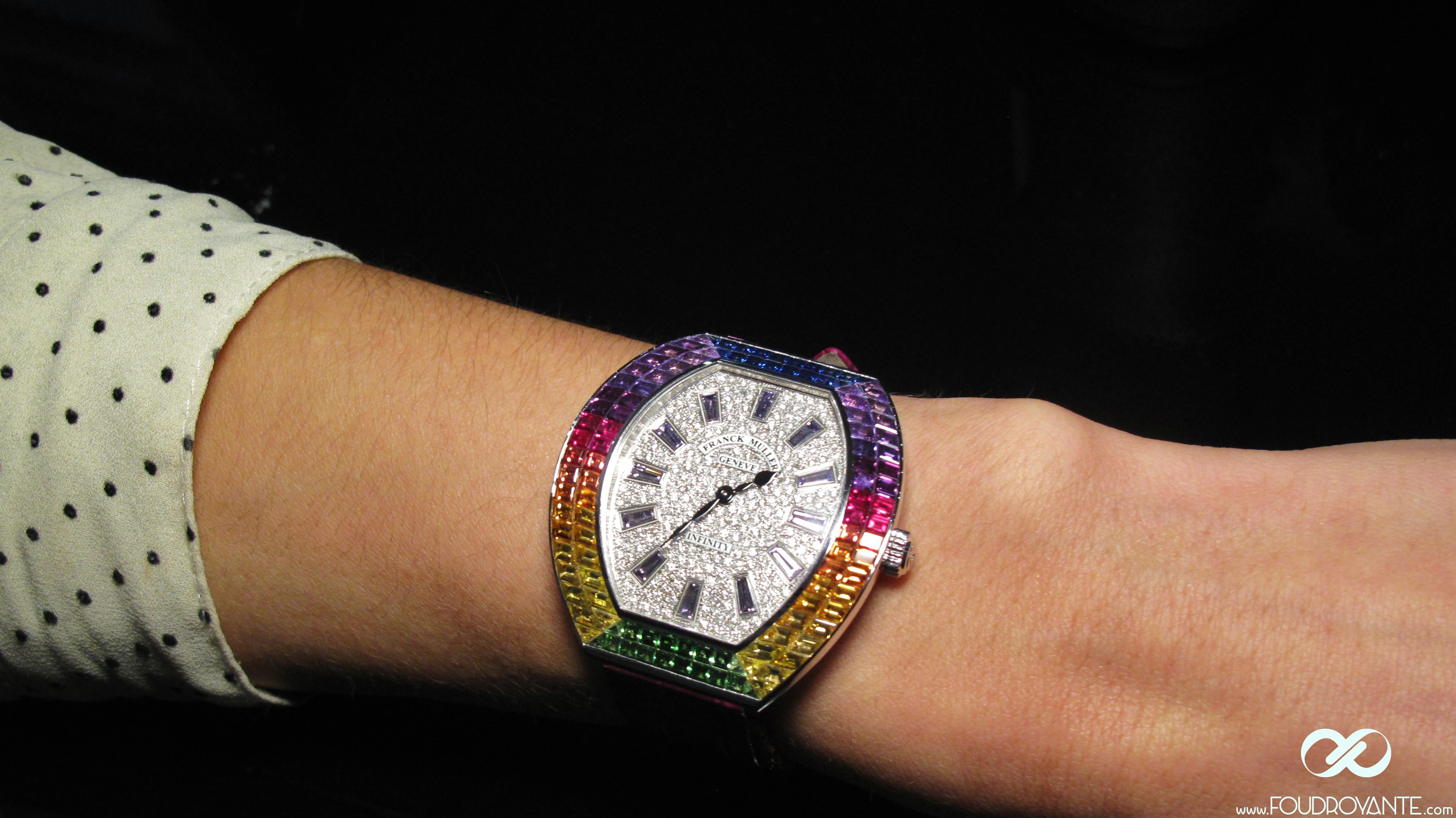
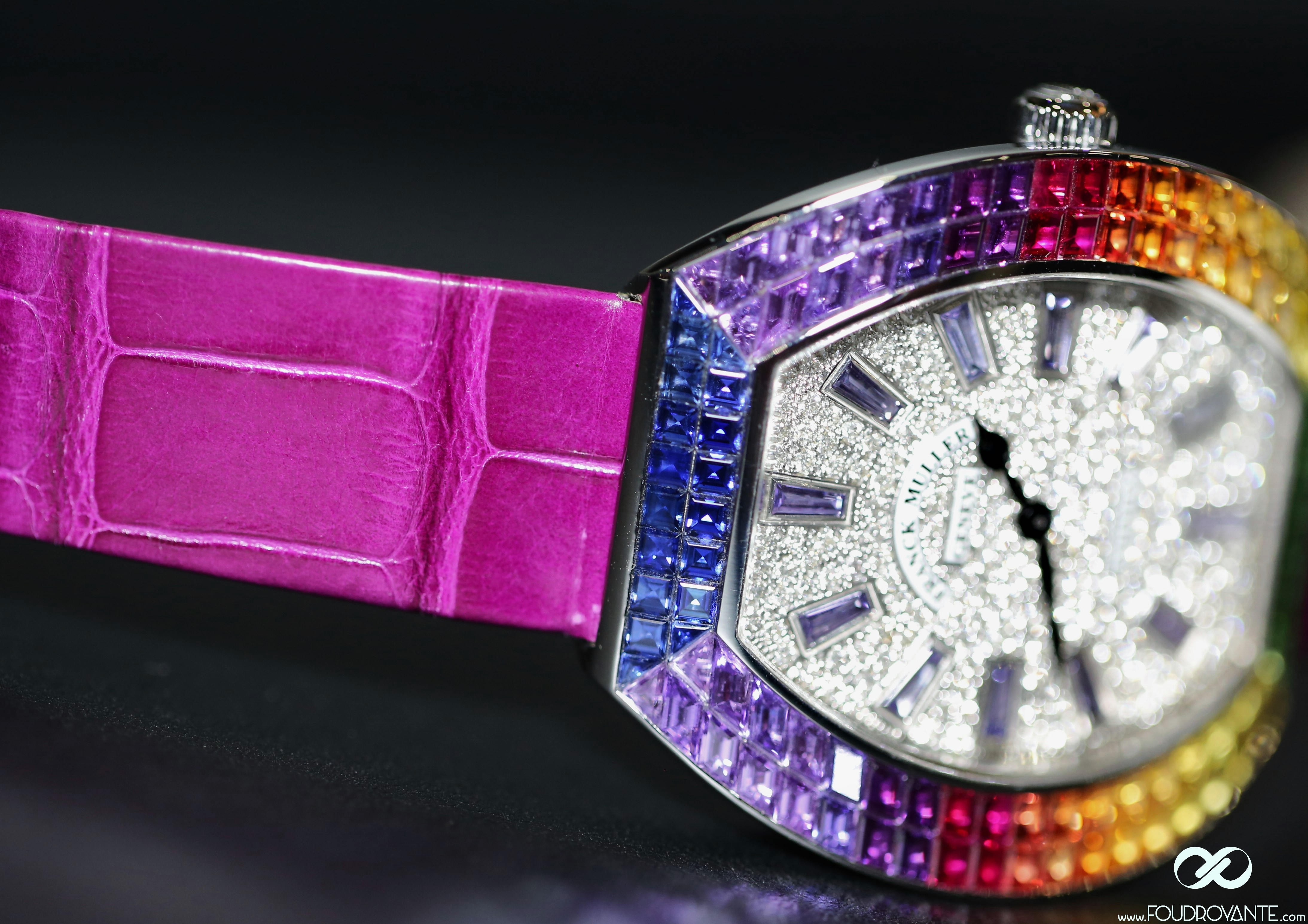
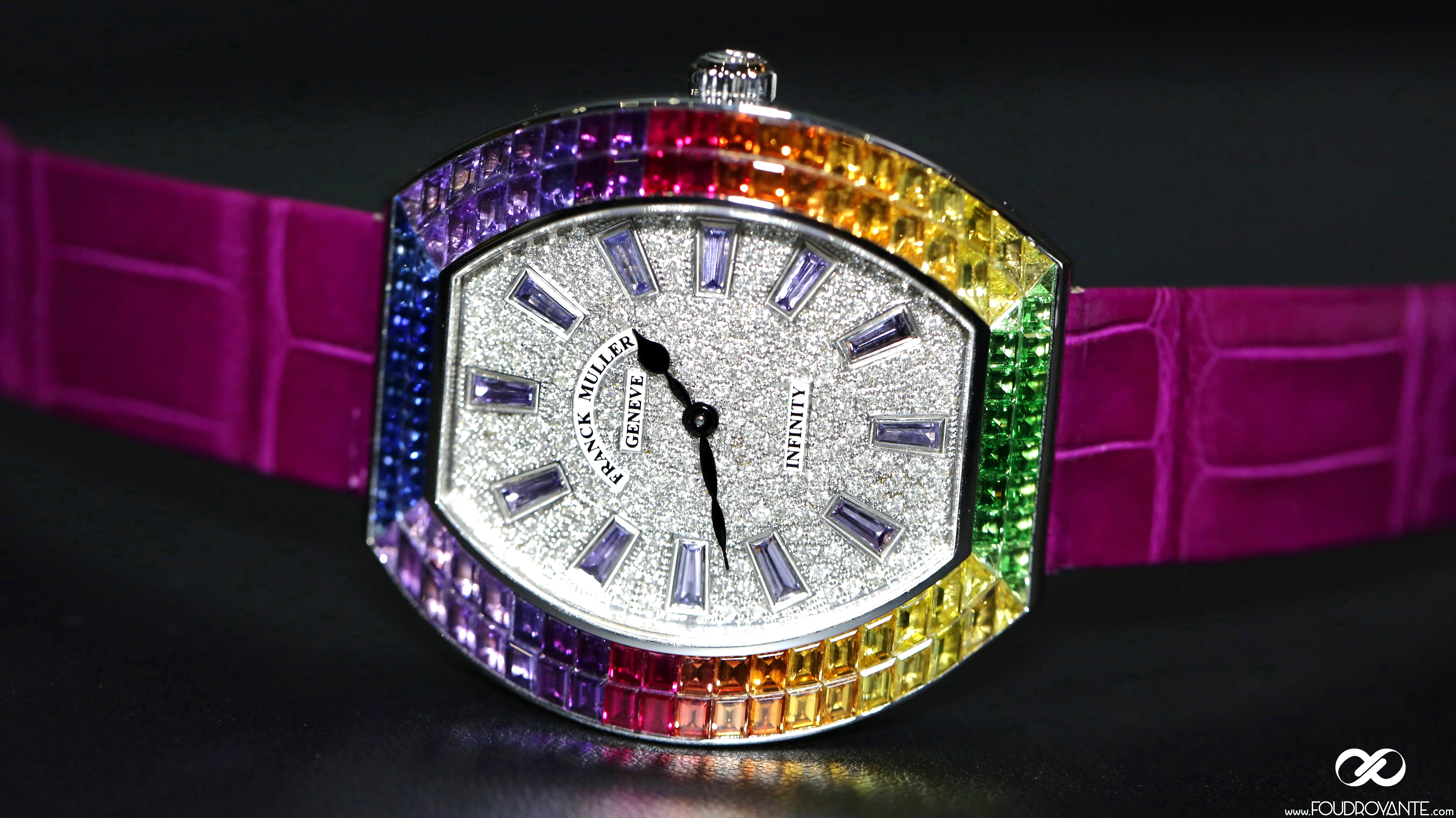
- That’s where the Franck Muller Infinity “Time is a woman”, which stands in stark contrast with the princess-little-flowers trend.
This watch combines setting, compulsory step (sorry gentlmen) of feminine watch, and visual offset, way funnier, contemporary, but yet classical.
The highlight of this watch is obviously the contrast between bright white tesselation (216 diamonds, 1.51 carats, 12 violet sapphires), and the tesselation of the bezel (bubies, sapphires: blue, yellow, orange and violet, and the green tsavorite, 112 stones, 7.51cts).
This rainbow pattern is the image of contemporary woman’s life: energetic, contrasting, extravagant.
There was some other pieces in the Infinity collection when I made up this selection, but the “Time is a woman” stood out from the others, thaks to its simplicity, topicality and originality.
It is a very endearing watch, suitable for all women, thanks to the versatility of its rainbow colours and its medium-sized white gold case: 40mm wide, by 43mm long. Only one regret however, le quartz movement doesn’t promote mechanical watches to women…
- The moral:
This Franck Muller WPHH2015 is interesting as it is antithetical to trend. This SIHH2015 had a unique watchmaking colour: very sophisticated neo-vintage watches, very beautiful, refined, very expensive and kind of boring.
On the contrary, Franck Muller comes up with beautiful items, of course, but a lot more sportive, funnier, bouncy, more frugal, with prices better adjusted to most of the enthusiasts and collectors.
In this sense, the Genthod’s conceptors and designers had better understanding of the Zeitgeist at the sart of this year.
CU.
Pif.
